Making apps free
Turns out people like free apps. Last week we made Wedding Anniversaries free for a few days and as expected, the downloads jumped from a few downloads a day to several hundreds each day. This wasn’t really a surprise as apps gone free are always picked up on social media and several websites that collect these apps.
I was sharing my experiences with Aaron, an iOS developer with several apps in the store (he also wrote a great SpriteKit with Swift tutorial guide that you should definitely check out) and he got very excited. Soon he decided to make his weather app Project Rainman also free. He just updated the app so timing was perfect for a small experiment. Then this happened:
And as a result, shortly after this happened:
Turns out the coverage the app got from the “apps gone free” type promotion was enough to boost the app into the top free weather apps in several countries, including the US. The app has beautiful design and it was no wonder it was climbing the charts once it got there. Excited about Aaron’s results, I immediately decided to try the same with Weather Compare, our simple weather comparison app that has been a paid app since it was first launched. To our huge surprise we were able to replicate the success of Project Rainman and also hit the US charts for Free Weather Apps (highest position #21). Within hours the app went from a mere few downloads to 4-digits a day. And here we are after two days:

Learnings
Now it’s not really a surprise that making apps free boosts your downloads. Nevertheless it was very exciting to experience such download volumes and the amount of feedback also multiplied. What surprised me was the effect on my other apps. Since making the app free, our app portfolio’s downloads have increased by 300-400%. I tried to think about my own behaviour when downloading apps and I can’t recall many times I have checked out the developers’ other apps unless it was a game I really liked and I knew they would have other similar types of apps. However it seems that users tend to do it whatever the app is. The thought of someone downloading Weather Compare and afterwards trying out Move the Lines sounds funny but it looks to happen!
I fully expect Weather Compare to crash through the download charts soon but it doesn’t mean this wasn’t a huge learning experience. We got a lot of feedback, mostly users complaining about not finding the option to change the measurement system. Weather Compare was one of my first personal apps and at the time it was fairly normal to put settings under the System Settings view. However our users don’t seem to find it and thus we plan to add a separate settings view into the app where users can change this. Maybe even a simple popup on the first app launch as you’d expect users to only set this once.
The main thing I learnt from making apps free was the boost I got on all the other apps. I totally underestimated the effect on downloads for all the other apps and I think this may be a very valuable tip for the future. On our next app release I plan to make all our apps free for a few days to hope build an audience the same way. Wether it will have an effect will be seen but during the first few days of an app launch every little bit helps.
If you’ve had similar experiences and if you use app discounts to promote your other apps, we would love to hear more! Contact us at contact (at) darksquaregames.com
Apple Museum in Prague
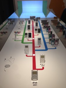
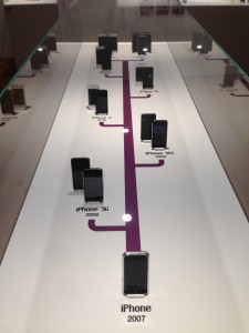
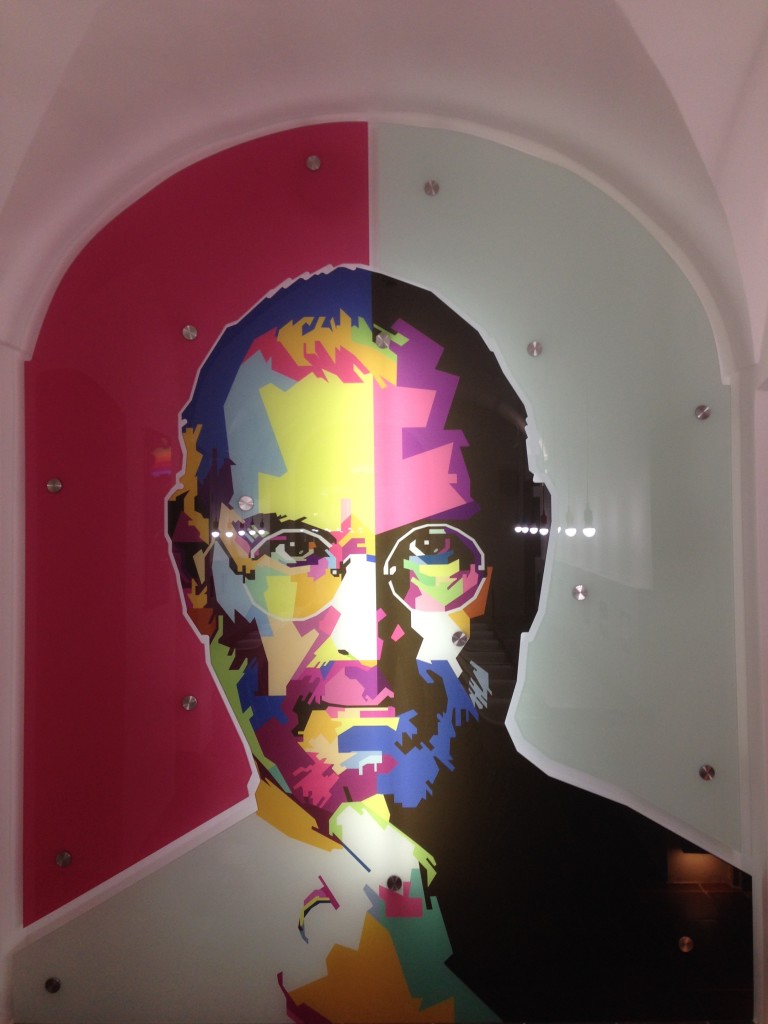
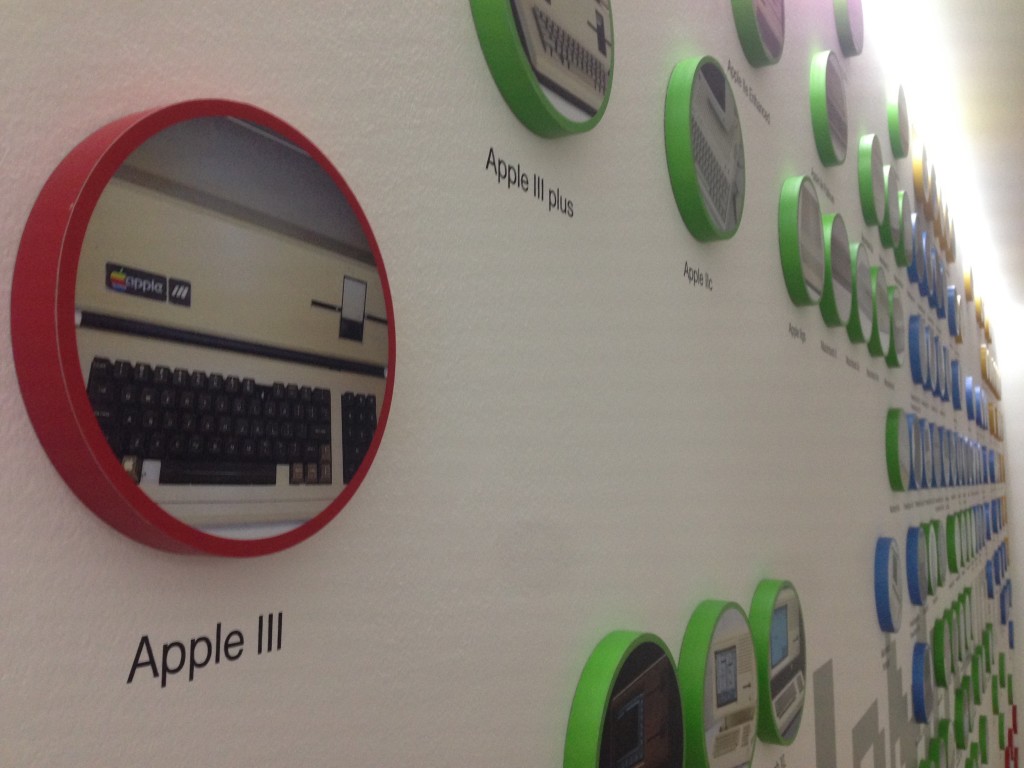
You heard me right! I was walking through the city of Prague in Czech Republic when I saw an Apple logo on a window in the city center. To my big surprise the logo didn’t turn out to be of an Apple retailer but a museum! Apparently just weeks before my visit, an anonymous collector opened up the largest private collection of Apple products in the world. Calling themselves the Apple Museum. It was too random of a coincidence to find this place so I had to pay it a visit. I spent a good hour walking around the exhibition of nearly 500 Apple products


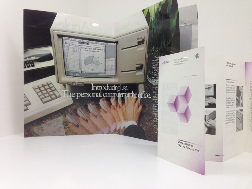
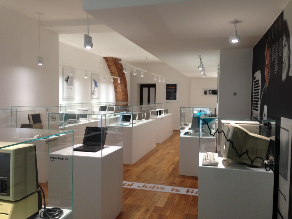
The Apple Museum was very atmospheric inside. On the background they played what i believe was Steve Jobs’s Stanford Commencement Address from 2005 and the walls were filled with quotes or covered with timelines of important events of the company history. The exhibition was set in two floors, with rooms dedicated to different areas and eras of Apple history and products. The museum was nicely and openly laid out and it was very interesting to walk through the steps of Apple’s history. In addition to the exhibition, they also just opened a small cafe called Steve’s Food that served raw vegan food. They were also about to open up an Apple shop but unfortunately they couldn’t tell me more about it.
I would definitely recommend visiting the Apple Museum if you are interested in Apple products and their history. I was fairly familiar with the history of the company beforehand but I’d seen most of the products only in photos and it was a great opportunity to see them all from close up. Compared to the surprisingly high museum prices in Prague, the ticket prices were also quite cheap and there was definitely a lot to see. As an added bonus, the museum claims that all the proceedings are donated to charity purposes so you’ll be basically doing a good thing!
Ticket prices
The tickets cost 300CZK (11 euros) with discounted tickets for families (700 CZK), students (220 CZK) and children (140 CZK).
Impressions


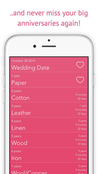
When i was 18, I got the chance to be a best man at my best friend’s wedding. Now years later we were discussing wedding anniversaries and we tried to remember the traditional meanings for them. The anniversary names were originally created to provide guidance for appropriate gifts for the spouses to give each other. We were surprised how they were almost the same in all the countries and the little App Developers in our heads had to check out if there were solutions out there in the App Store to remember all these. Turns out, there are a TON of wedding and anniversary countdown apps out there, but none for remembering these traditional dates. So we figured, what better way to start 2016 than by creating a tiny app to help couples remember theirs.
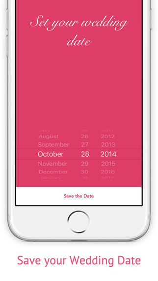
A day later we had a working version of the app ready to be submitted. The app is extremely simple. The first view asks the users their wedding date and the following list view presents the user with all the anniversary dates, their names and how much time is left for this particular date. The app was promptly reviewed by Apple and is now available on the App Store.


For your interest, here is a list of all the wedding anniversaries in US and in many other countries as found from Wikipedia.
Wedding Anniversaries by years
1 year: Paper
2 years: Cotton
3 years: Leather
4 years: Linen
5 years: Wood
6 years: Iron
7 years: Wool/copper
8 years: Bronze
9 years: Pottery
10 years: Tin
11 years: Steel
12 years: Silk
13 years: Lace
14 years: Ivory
15 years: Crystal
20 years: China
24 years: Opal
25 years: Silver
30 years: Pearl
35 years: Coral
40 years: Ruby
45 years: Sapphire
50 years: Gold
55 years:Emerald
60 years: Diamond
65 years: Blue Sapphire
70 years: Platinum
75 years: Diamond/Gold
80 years: Oak
85 years: Moonstone
90 years: Granite
As a long-time chess player, I’ve been part of many chess clubs and one thing that has been common with all of them are weekly tournaments. In these tournaments players of all ages and levels come together and most commonly play a round of blitz with both players having 5 minutes for a match. The tournament organisers collect the names of all participants and draw a grid with each player assigned a number. Then the organiser calls out all the player names and seats them to an appropriate board. After each match, the players let the organiser know the match result. The organiser marks the result in his results table. Now every player steps to the seat on his left, and magically after a number of rounds, all the players have played against each other once and the tournament results can be seen from the table. This system is called Round-Robin.
Having gone through this ritual probably hundreds of times, I figured it could be an interesting opportunity for an app. So I decided to develop an app for the tournament organisers.
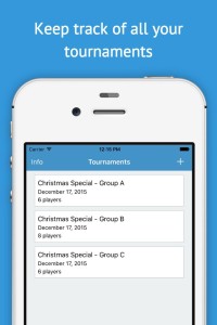
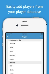
The first screen of the app allows users to create and manage tournaments. I wanted the users to be able to easily switch between tournaments, which comes in handy when there are more than one group playing at the same time. The second feature I really wanted was to make adding new players very easy. As the players in these club tournaments are most often the same, it doesn’t make sense to input them by typing every time so I decided to allow the users to select participants from all the previous tournament participants in the app. This will hopefully make the registration process a lot faster.


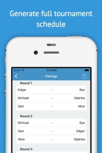
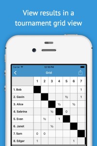
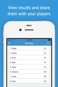
Once the user has selected all the participants and the tournament is ready to start, the app generates a match schedule for the whole tournament. The user can easily seat the players according to the schedule. The tournament view consists of 3 tabs: matches, grid and standings. Matches tab simply presents the user with the match schedule and the user can input match results here directly. The grid is a typical tournament grid that may help visualise the tournament. And finally the third tab is for final standings, that are updated live as the tournament progresses.


Lastly, I wanted the users to be able to share their results. Organisers usually post the final standings on an email list or something, but with our app, they are able to email the participants all the aspects of the tournament, including the match schedule with individual match results, the grid and the final standings.
The app is now live in the App Store. I am already considering future update for the app, for example I played with an idea of being able to snap photos of each tournament, which would make sharing the results even more interesting for the participants. All feedback and feature ideas are more than welcome!


