Round-Robin app for tournament management

As a long-time chess player, I’ve been part of many chess clubs and one thing that has been common with all of them are weekly tournaments. In these tournaments players of all ages and levels come together and most commonly play a round of blitz with both players having 5 minutes for a match. The tournament organisers collect the names of all participants and draw a grid with each player assigned a number. Then the organiser calls out all the player names and seats them to an appropriate board. After each match, the players let the organiser know the match result. The organiser marks the result in his results table. Now every player steps to the seat on his left, and magically after a number of rounds, all the players have played against each other once and the tournament results can be seen from the table. This system is called Round-Robin.
Having gone through this ritual probably hundreds of times, I figured it could be an interesting opportunity for an app. So I decided to develop an app for the tournament organisers.
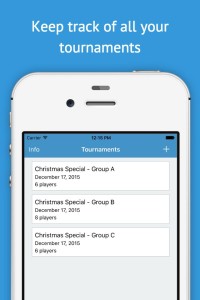
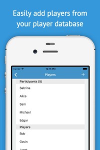
The first screen of the app allows users to create and manage tournaments. I wanted the users to be able to easily switch between tournaments, which comes in handy when there are more than one group playing at the same time. The second feature I really wanted was to make adding new players very easy. As the players in these club tournaments are most often the same, it doesn’t make sense to input them by typing every time so I decided to allow the users to select participants from all the previous tournament participants in the app. This will hopefully make the registration process a lot faster.
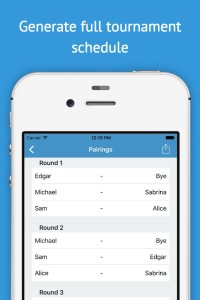
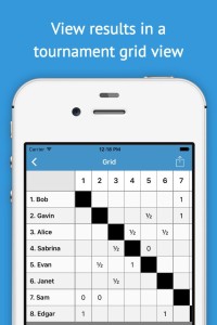
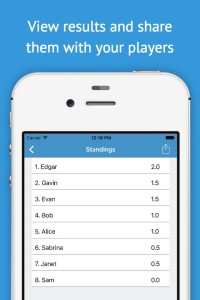
Once the user has selected all the participants and the tournament is ready to start, the app generates a match schedule for the whole tournament. The user can easily seat the players according to the schedule. The tournament view consists of 3 tabs: matches, grid and standings. Matches tab simply presents the user with the match schedule and the user can input match results here directly. The grid is a typical tournament grid that may help visualise the tournament. And finally the third tab is for final standings, that are updated live as the tournament progresses.
Lastly, I wanted the users to be able to share their results. Organisers usually post the final standings on an email list or something, but with our app, they are able to email the participants all the aspects of the tournament, including the match schedule with individual match results, the grid and the final standings.
The app is now live in the App Store. I am already considering future update for the app, for example I played with an idea of being able to snap photos of each tournament, which would make sharing the results even more interesting for the participants. All feedback and feature ideas are more than welcome!
